Back
Chingari Homepage re-design
Improving clarity, user flow and conversion.
My Role
Lead UI/UX Designer — Research, Interaction Design, Visual Design, Prototyping, 3D aniamtion
Team
Ajith V - 3D Artist
Jai - UXR
Bernard - PM
Timeline & Status
2 Months
Overview
Chingari is a multi-chain Web3 social media and entertainment platform that operates on an engage-to-earn model, allowing users to create, share, and earn through short-form video content.
PROBLEM STATEMENT
"The existing Chingari homepage was failing to effectively engage users and convert them into app downloads."
SOLUTION
"Redesigning Chingari’s homepage to drive stronger app conversion by solving clarity and engagement gaps in the user journey."
THE PROCESS
Crafting a Delightfull Experience
I followed the Double Diamond approach, balancing user needs and business goals through research, ideation, design, and handoff phases across an agile 8-week timeline to solve Chingari’s engagement and conversion challenges.

DISCOVERY
Quantitative Insights
DROP OFF RATE
57%
DOWNLOAD CTR
1.7%
AVG TIME SPENT
00:05 Sec
DROP OFF RATE
47%
DOWNLOAD CTR
3.4%
AVG TIME SPENT
00:15 Sec
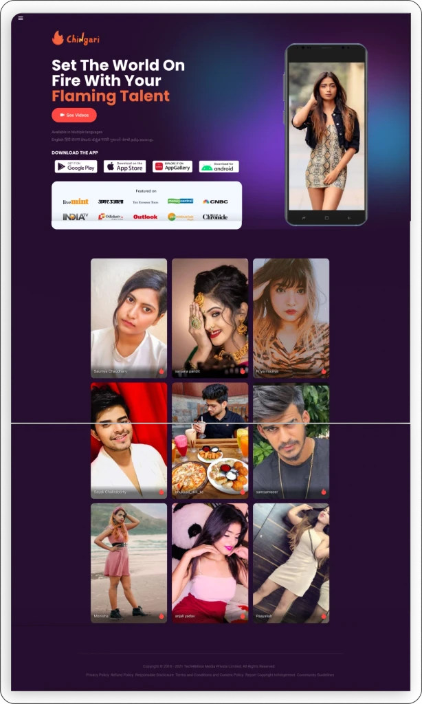
Here’s a snapshot of the previous website version
1
Lack of Context
The homepage failed to communicate what Chingari is, its purpose, and the unique tokenomics model. This created uncertainty and left visitors without a clear reason to engage or download the app.
2
Design Inconsistency
The website design was not updated to match the latest app interface. This inconsistency disrupted user trust and created a fragmented brand experience
3
Irrelevant Content
Some sections on the homepage showcased information that did not align with our target personas or user expectations.
4
Misaligned Primary Action
The main CTA on the homepage directed users to the web version of the platform instead of driving app downloads, which was the key conversion goal.

HYPOTHESIS
"We believe that providing clear information about the app, maintaining design consistency, reducing cognitive load, and prioritizing the app download action will help potential users better understand Chingari’s value and lead to higher engagement and improved conversion rates."
DESIGN
Starting with Content
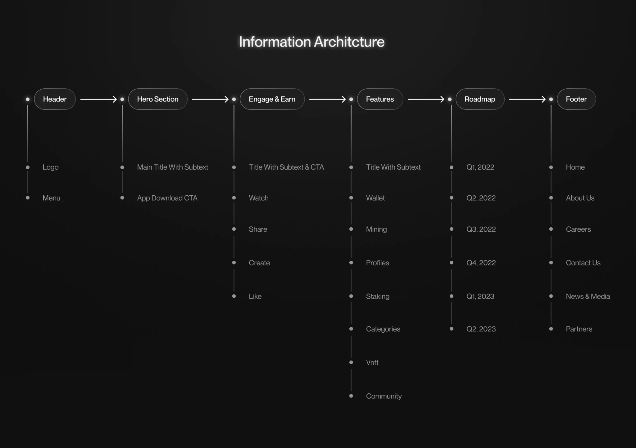
We began by mapping the user journey, focusing on key expectations and touchpoints when visiting the Chingari homepage. Our goal was to align the content with both user needs and business priorities. This process helped us identify the missing information. Based on these, we structured a clear information architecture
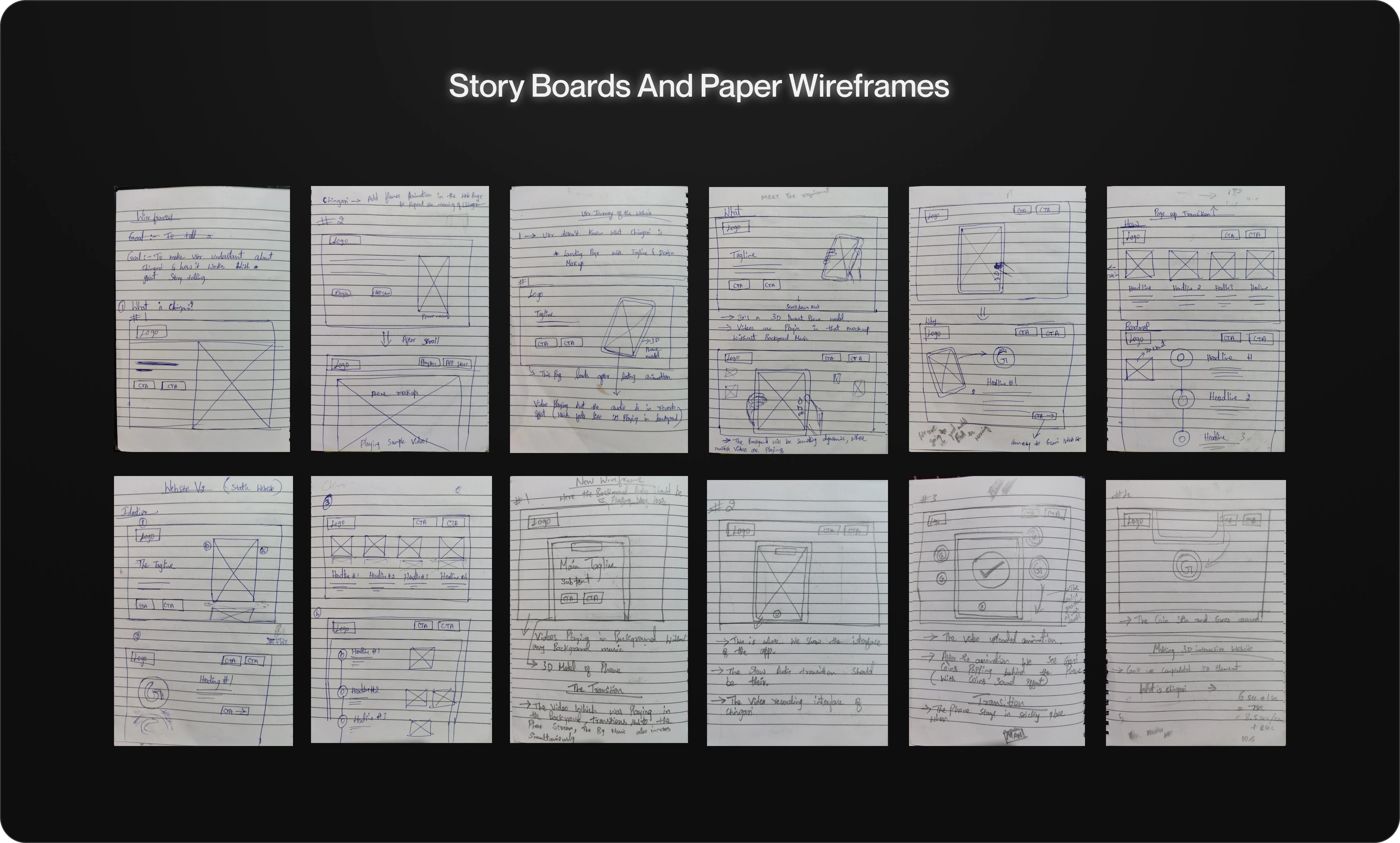
Conceptualization
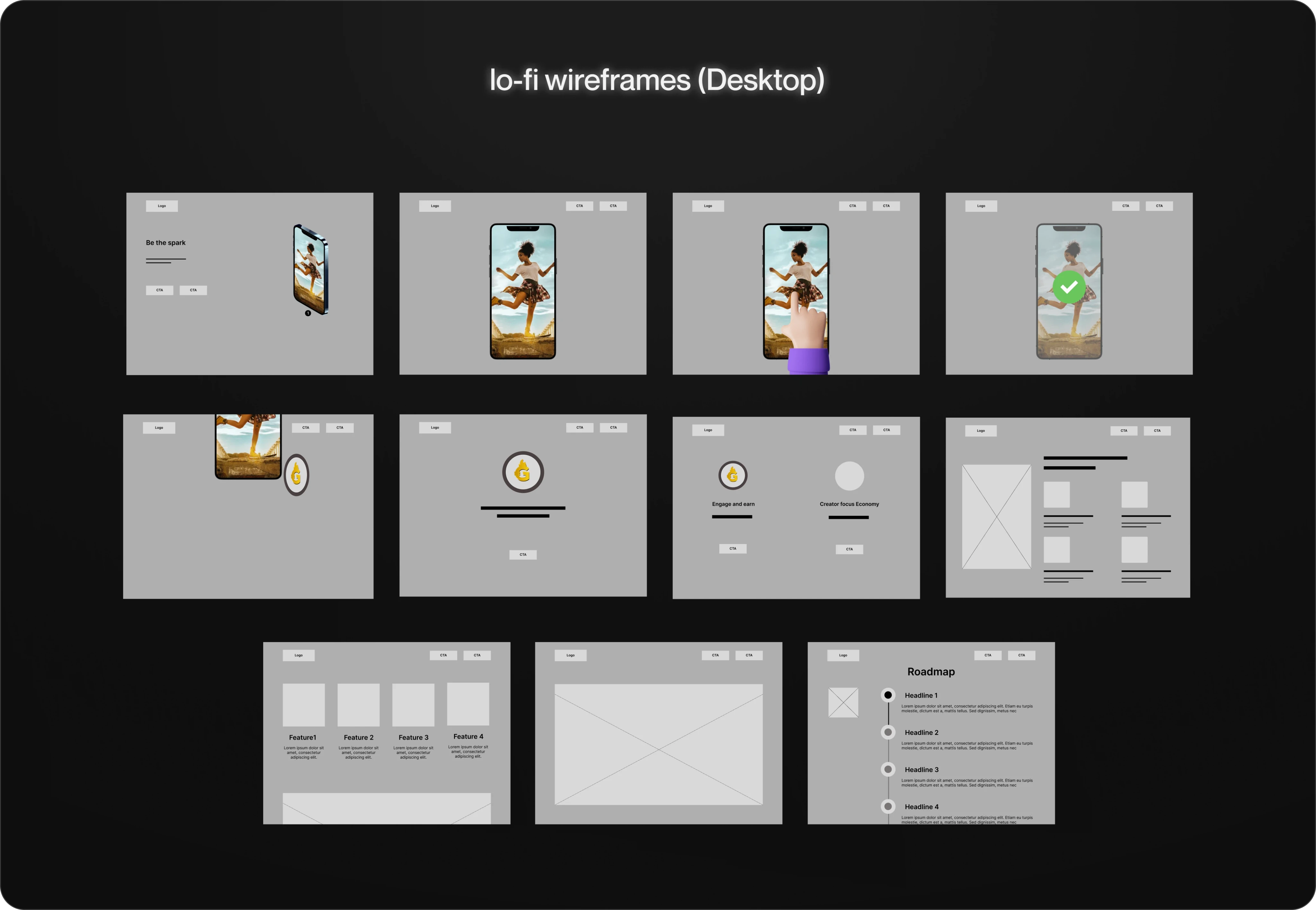
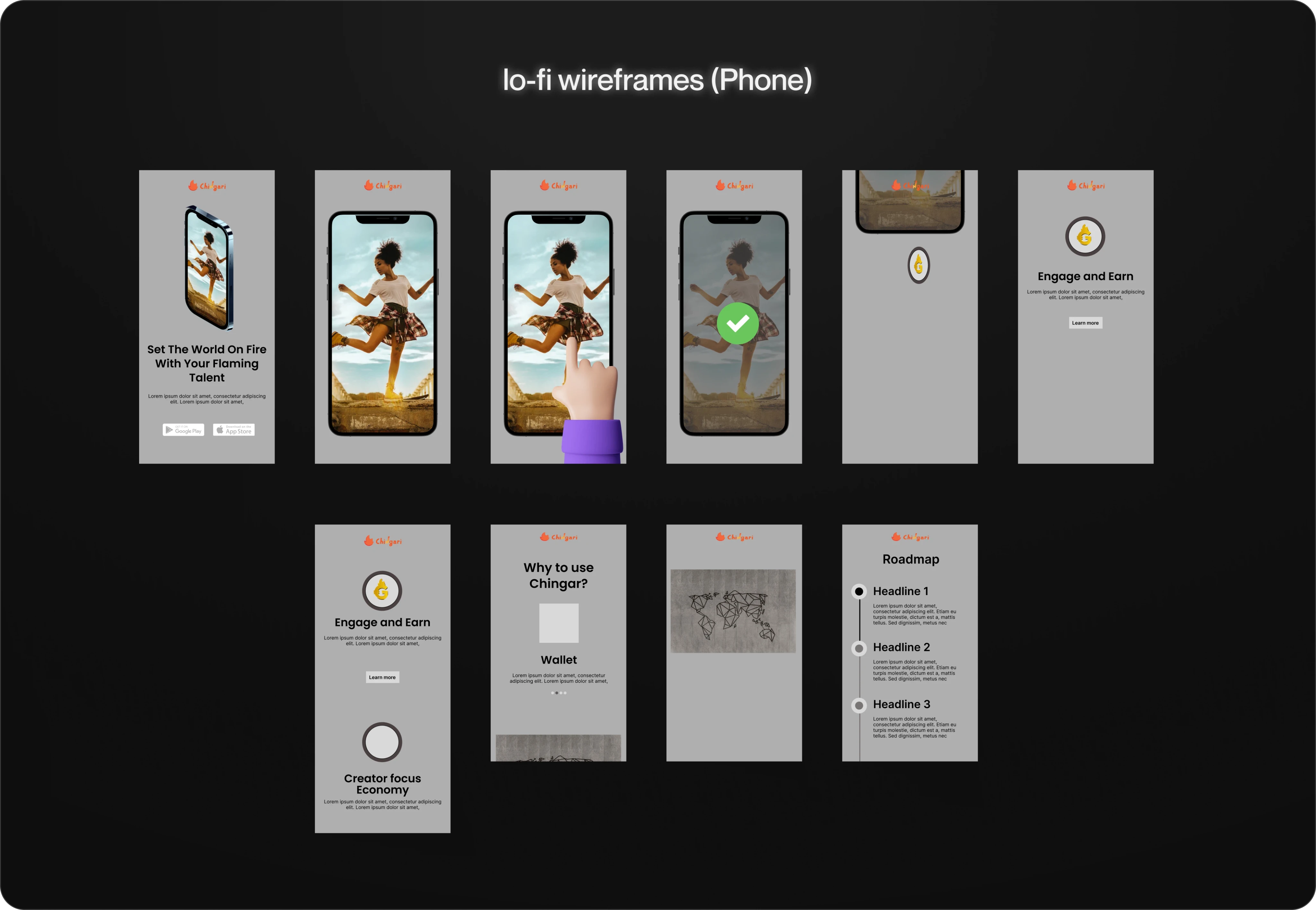
Moving from the information architecture, we transitioned into wireframing, starting with basic paper sketches to outline our direction. These initial sketches provided a foundational understanding. Subsequently, we developed low-fidelity digital wireframes for both desktop and mobile versions. These wireframes acted as structured blueprints, outlining element placement and interactions across devices.
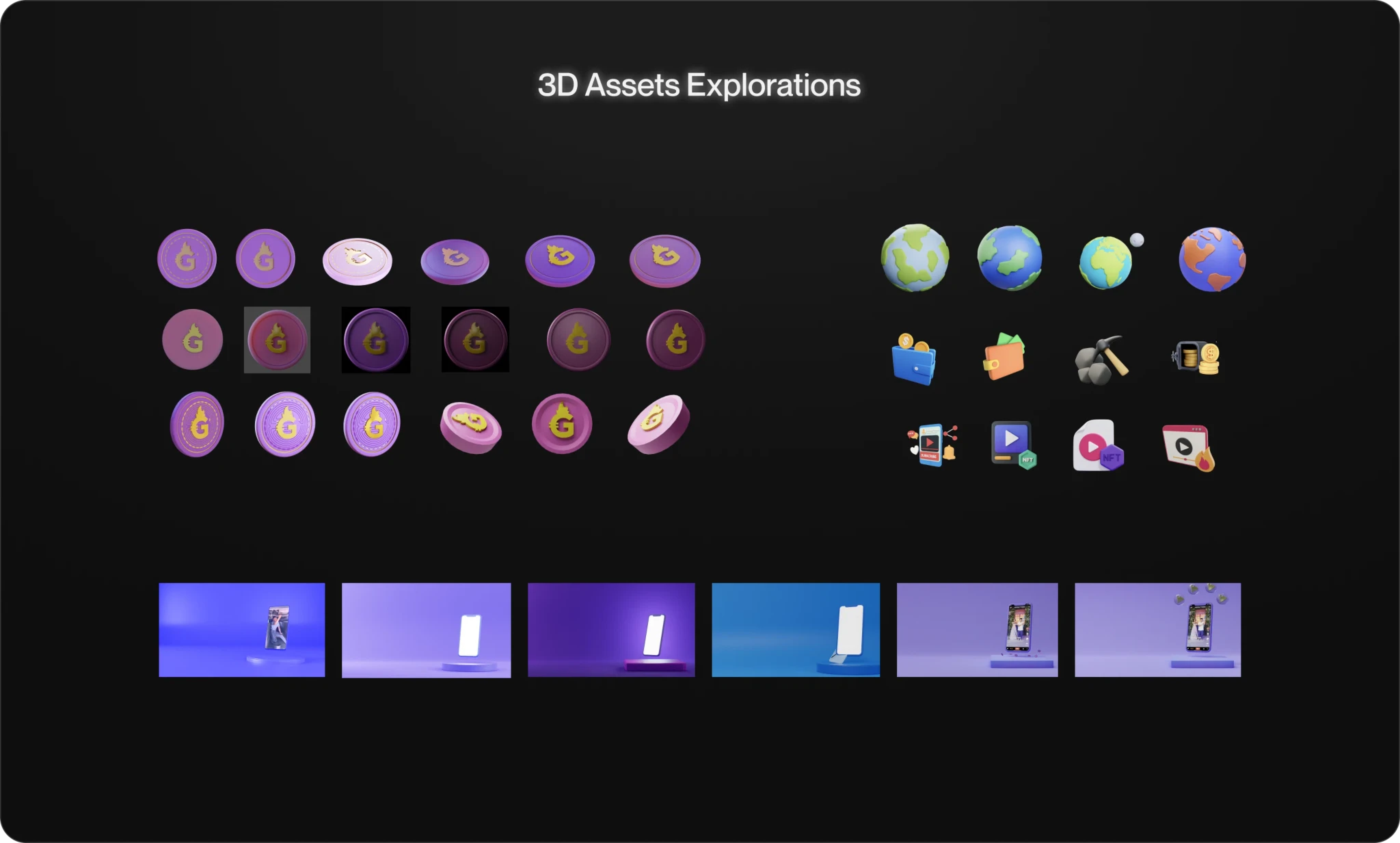
Visual Explorations
After Wireframes, we explored and designed diverse themes, incorporating colors, fonts, and assets based on earlier wireframes. This comprehensive approach aimed to leave no detail overlooked. After thorough exploration, we shortlisted one theme that best embodied the desired user experience and platform aesthetics, refining it for a cohesive Chingari design moving forward.
CHALLENGES
During the feedback phase, developers raised concerns that scroll-based animations would be challenging to implement within the project timeline and could negatively impact performance, especially for our mobile-first audience.
Pre-Visualization
Once we finalized the visual direction, we created a high-fidelity interactive prototype to showcase the intended interactions and animations. This previsualization helped us effectively communicate the user flow, transitions, and key engagement moments to both stakeholders and the development team. It served as a valuable alignment tool, ensuring that everyone had a clear, shared understanding of the final vision before implementation.
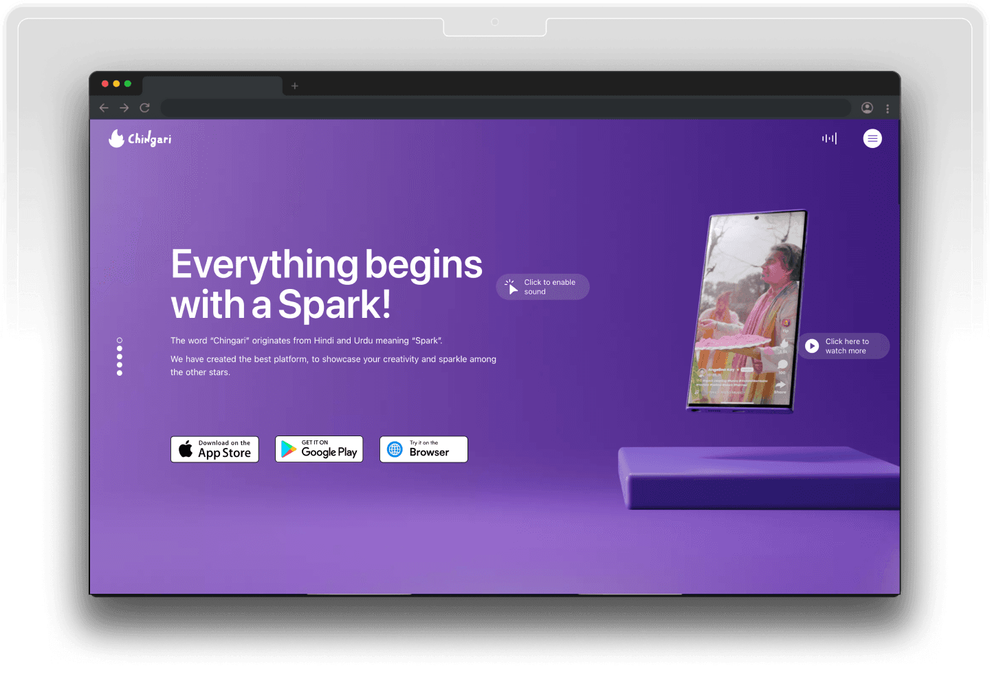
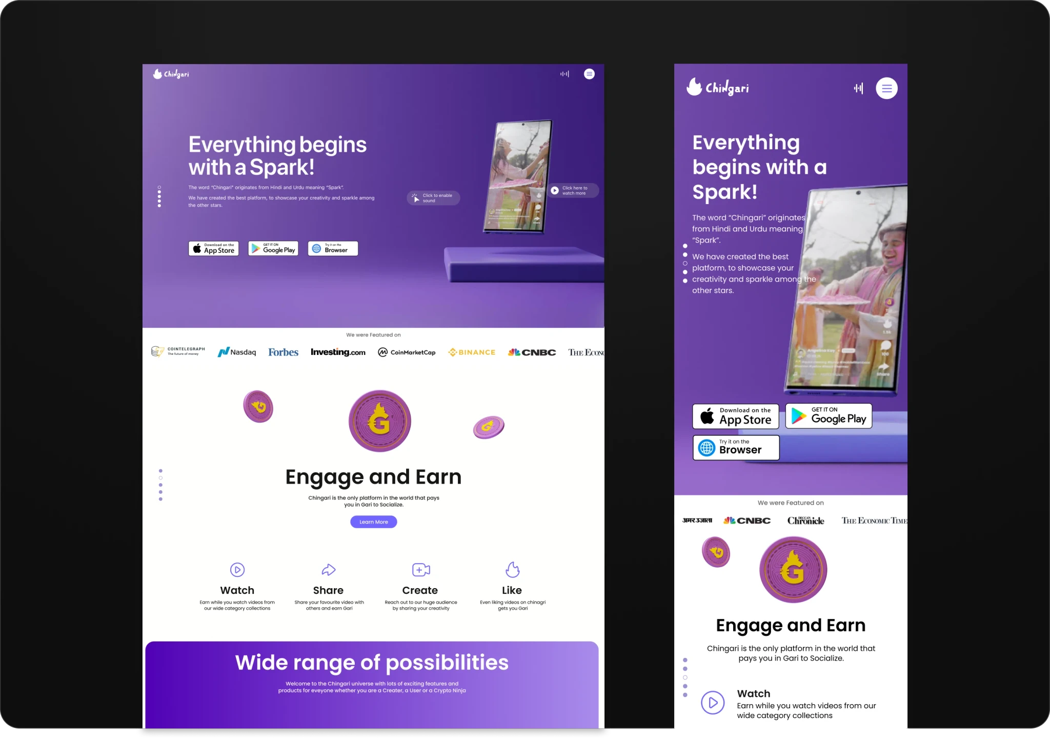
Final Design
Based on the feedback, I refined the design to balance performance and visual appeal. Without compromising the core design intent, I developed an optimized version that maintained engaging visuals while ensuring fast load times and a smooth mobile experience.

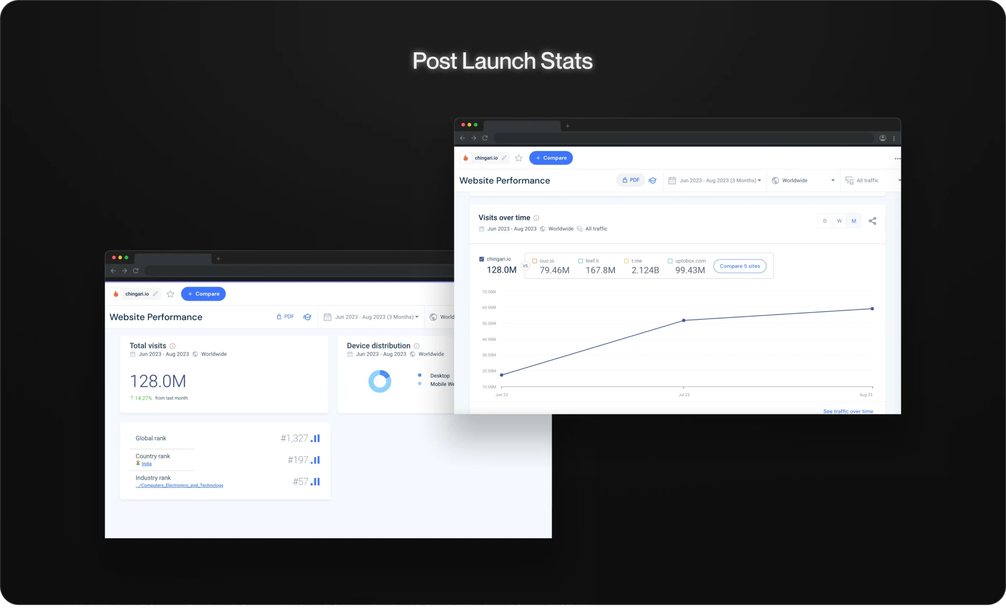
IMPACT
The final solution drove noticeable impact aligned with our project goals.
Project Takeaways
This project taught me how to strike the right balance between UI and UX. During the visual design phase, I initially focused too much on making the prototype look visually impressive, but I realized that it wasn’t effectively serving the user goals. It reminded me that great design isn’t just about how it looks — it’s about how it works.
Next project:
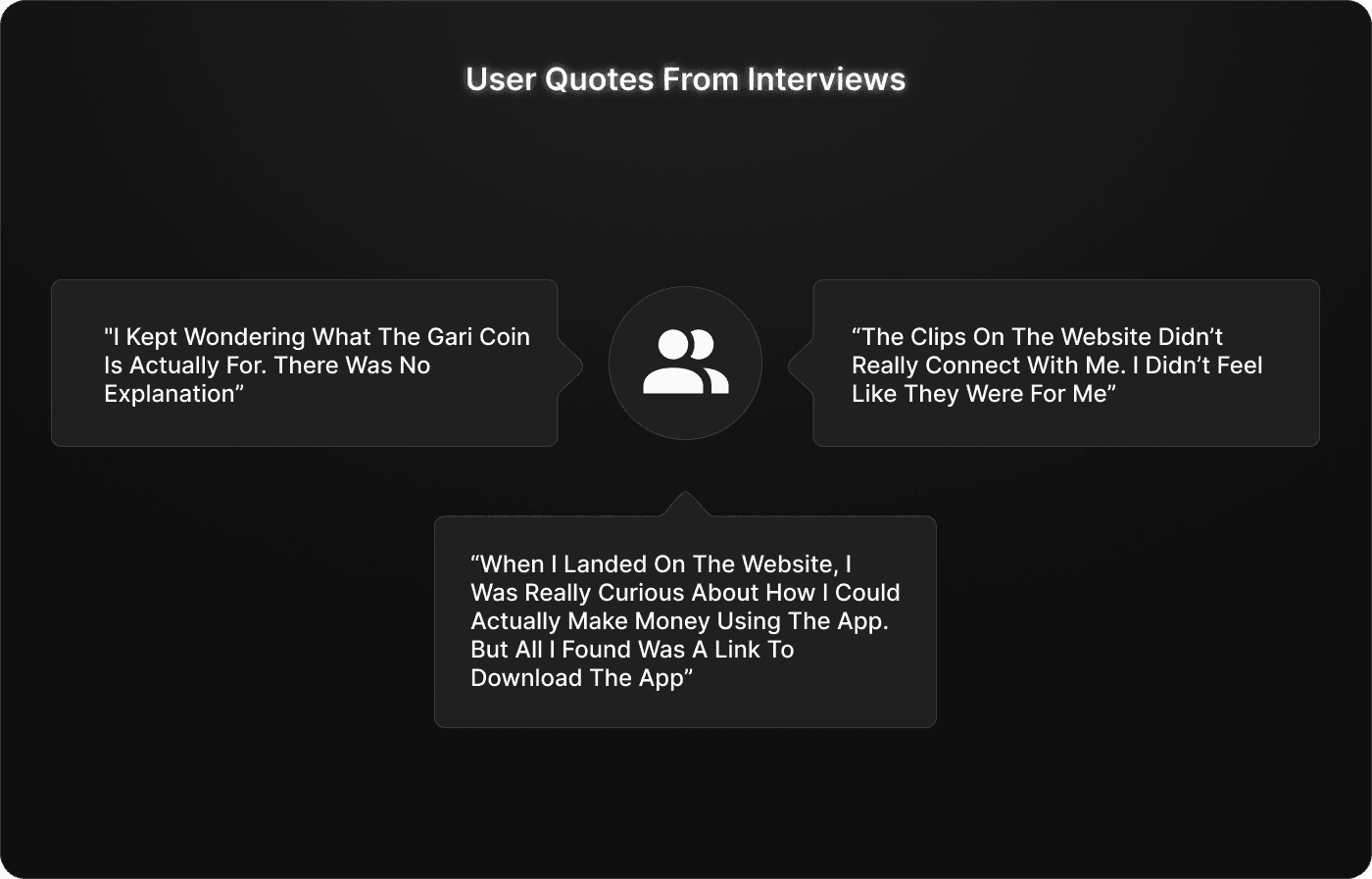
Heurustic Insights
We conducted a heuristic evaluation based on Nielsen’s usability principles to assess the existing homepage. The identified issues were prioritized using a severity rating scale and aligned with our project goal to improve engagement and app conversion.