Live site
Back
Kim'c Market Website Re-Design
A UX case study on Enhancing the Shopify shopping experience through data-driven UX design
My Role
UI/UX Designer — Conducting Research, Analyzing, Evaluating, and Designing
Team
Woohee
Samantha Guzman
Elizabeth Ward
Joee Cortes
Roshan Pereira
Timeline
4 Weeks
Overview
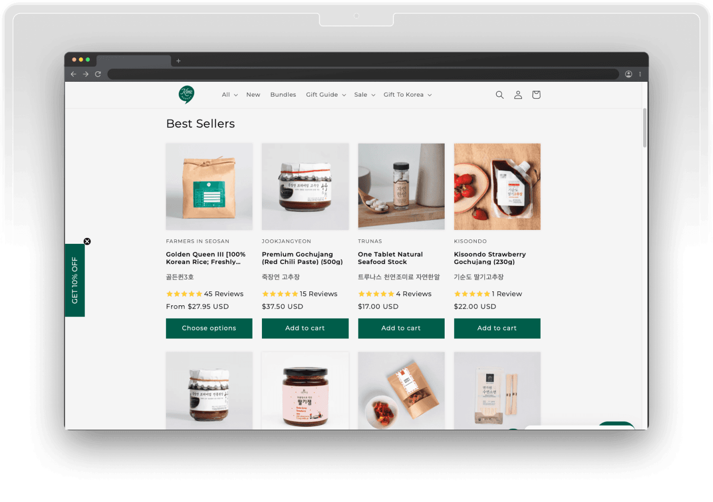
Kim’C Market is a Brooklyn-based online store offering premium Korean grocery products through a Shopify-powered e-commerce platform. This project focused on enhancing the digital shopping experience by identifying friction points in the user journey and implementing data-driven improvements aimed at increasing conversion rates and reducing bounce rates.
"How might we identify and eliminate key friction points in the user journey to improve conversion rates and reduce bounce rates?."
BUSINESS CHALLENGE
Conversion Metrics That Sparked the Redesign
Despite strong product quality and a loyal customer base, Kim’C Market faced friction in key parts of the user journey. High bounce rates, cart abandonment, and low mobile conversions pointed to usability gaps that directly impacted growth.
LOW CONVERSION RATE
1.76%
CART ABANDONMENT RATE
81.6%
BOUNCE RATE
58.04%
RESEARCH
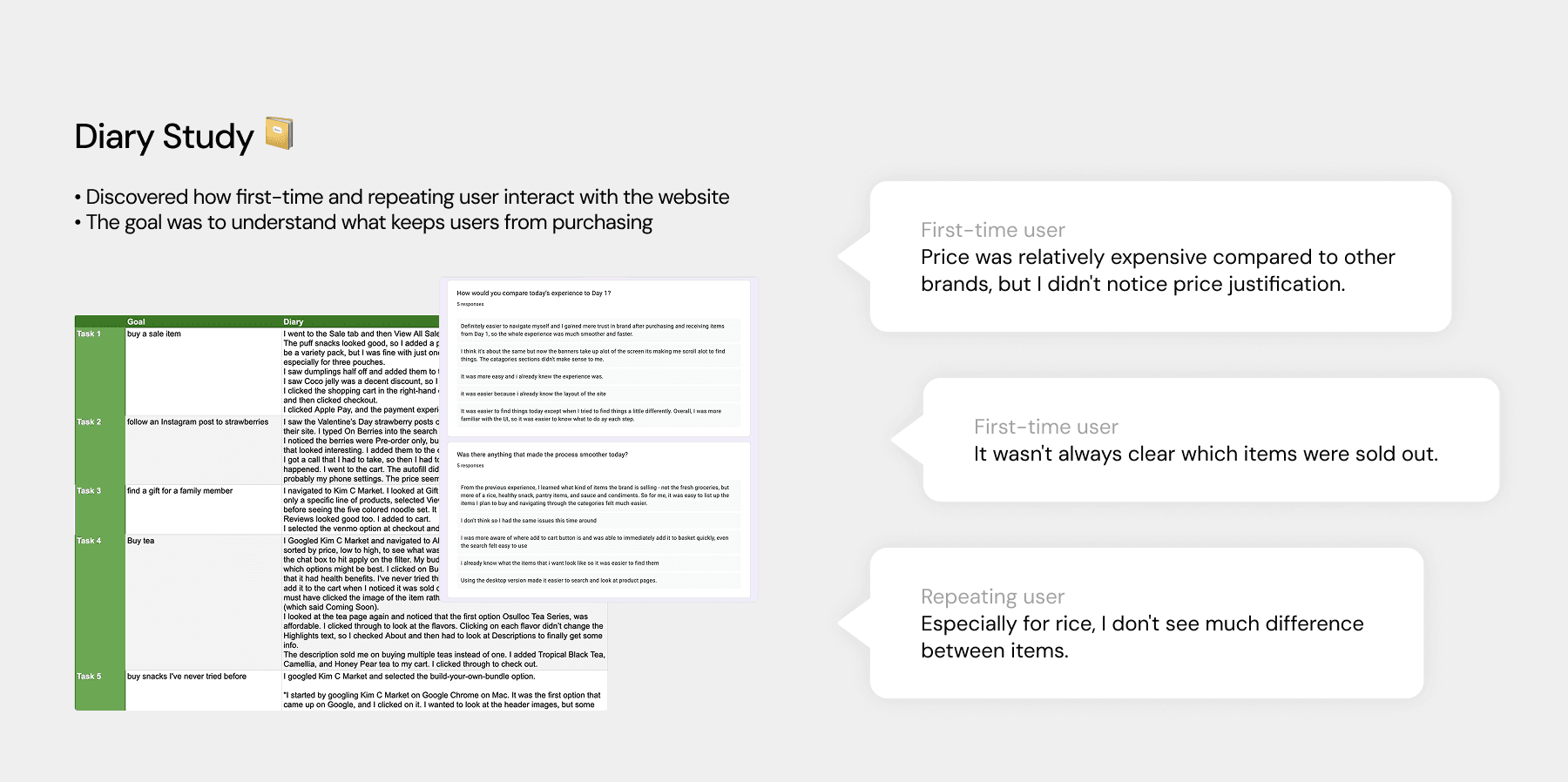
Learning from User's Experience
To better understand user pain points and decision-making behavior, we conducted a diary study with both first-time and returning customers. Participants were asked about their experience, including any confusion, hesitation, or frustration they encountered during browsing, cart review, and checkout. This gave us rich, unfiltered insight into how real users navigate Kim’C Market in their own context.
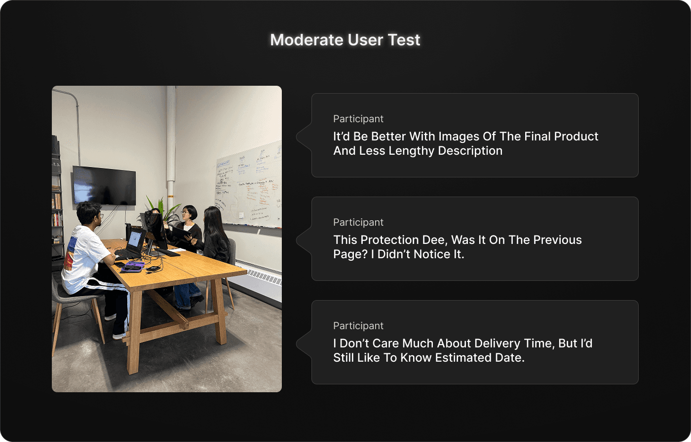
MODERATE USABILITY TESTING
Diving Deep into User thoughts
To dive deeper into user behavior, we conducted moderated usability testing with both new and returning users. Participants were assigned key shopping tasks—such as browsing products, using filters, adding items to the cart, and proceeding to checkout. During and after each task, we asked follow-up questions to uncover why users hesitated, got confused, or dropped off, helping us identify usability gaps and opportunities for improvement.
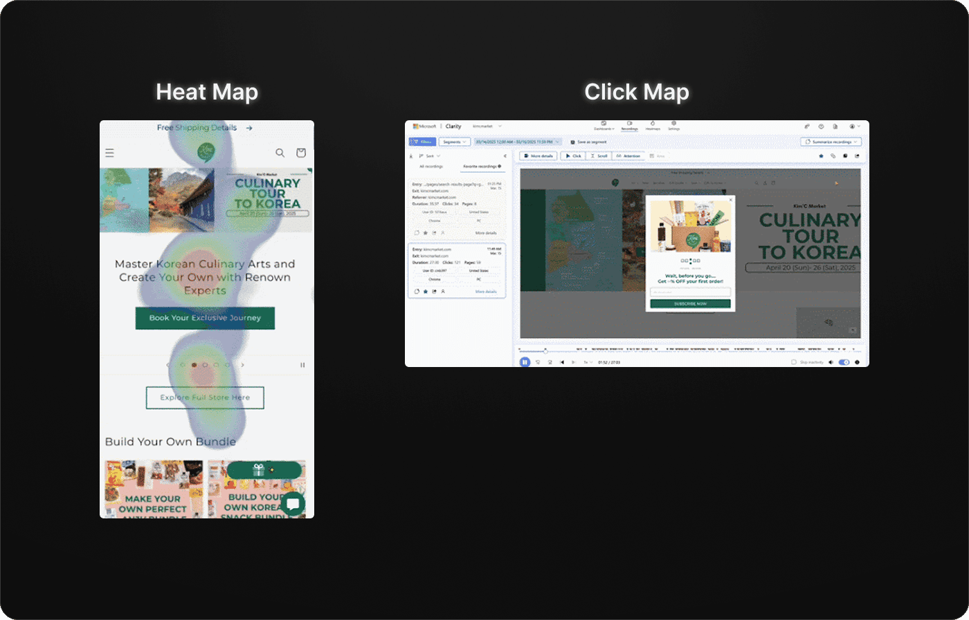
Validating issues with eyes tracking + Clicks
While conducting moderated usability tests, we also recorded eye-tracking heatmaps using Tobii hardware to visualize where users focused their attention. This helped us identify overlooked elements, visual clutter, and misaligned content hierarchy.
In parallel, we used Microsoft Clarity to monitor real user click maps, validating the usability issues surfaced during testing—such as missed buttons, rage clicks, and unexpected behavior patterns.
PROBLEMS IDENTIFIED
Turning Insights into Actionable Problems
By analyzing patterns across diary studies, moderated user testing, and behavioral tools like eye-tracking and click maps, we identified recurring UX challenges. Users struggled with visual clutter during product discovery, lacked clarity around pricing and shipping, and often encountered unexpected fees at checkout.
These consistent friction points helped us translate vague performance issues into specific, designable problems that could be directly addressed in the next phase.
1
Product Discovery
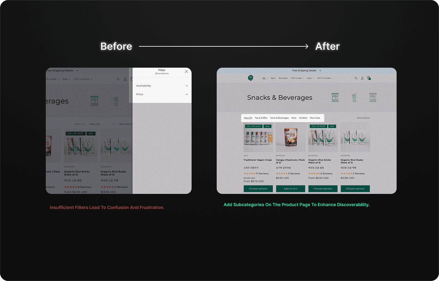
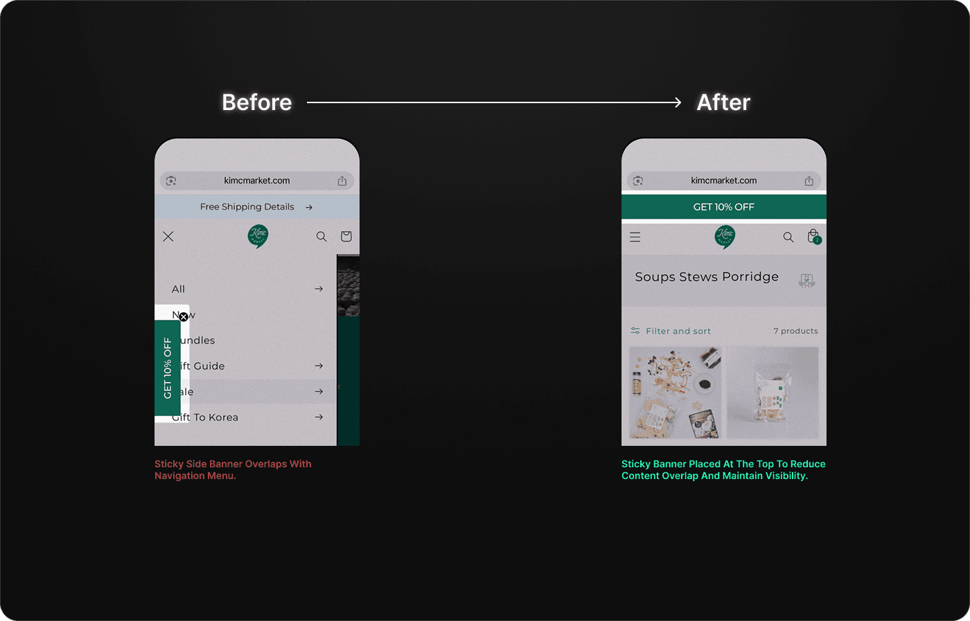
-Promotional banner distracts on mobile.
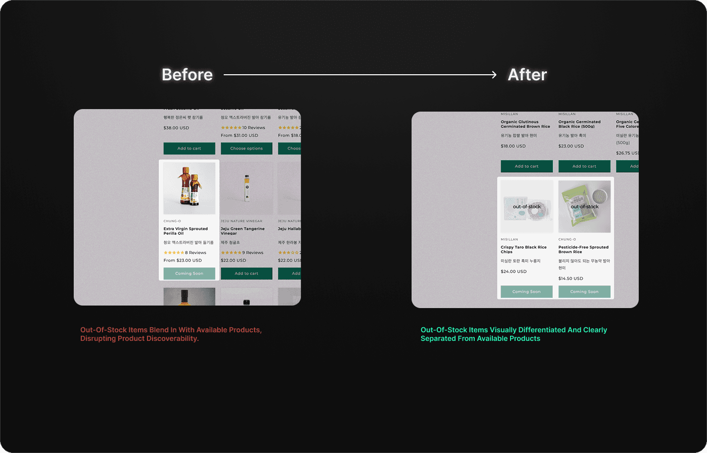
-Out-of-stock items lack clear visual indicators.
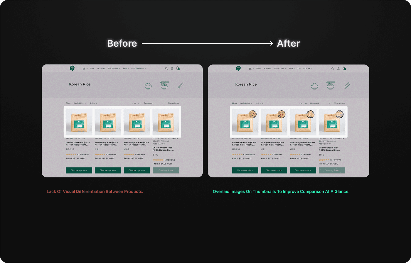
-Visual content feels disconnected from product context.
2
Cart Abandonment
-High pricing lacks clear value justification.
-Users struggle to compare products effectively.
3
Checkout Abandonment
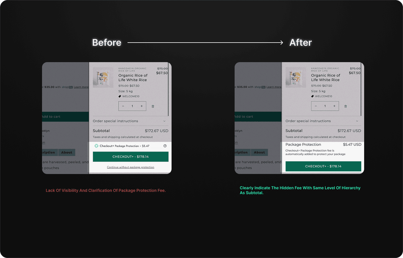
-Package protection fee appears unexpectedly.
-Key shipping details are missing at checkout.
UX DIRECTION
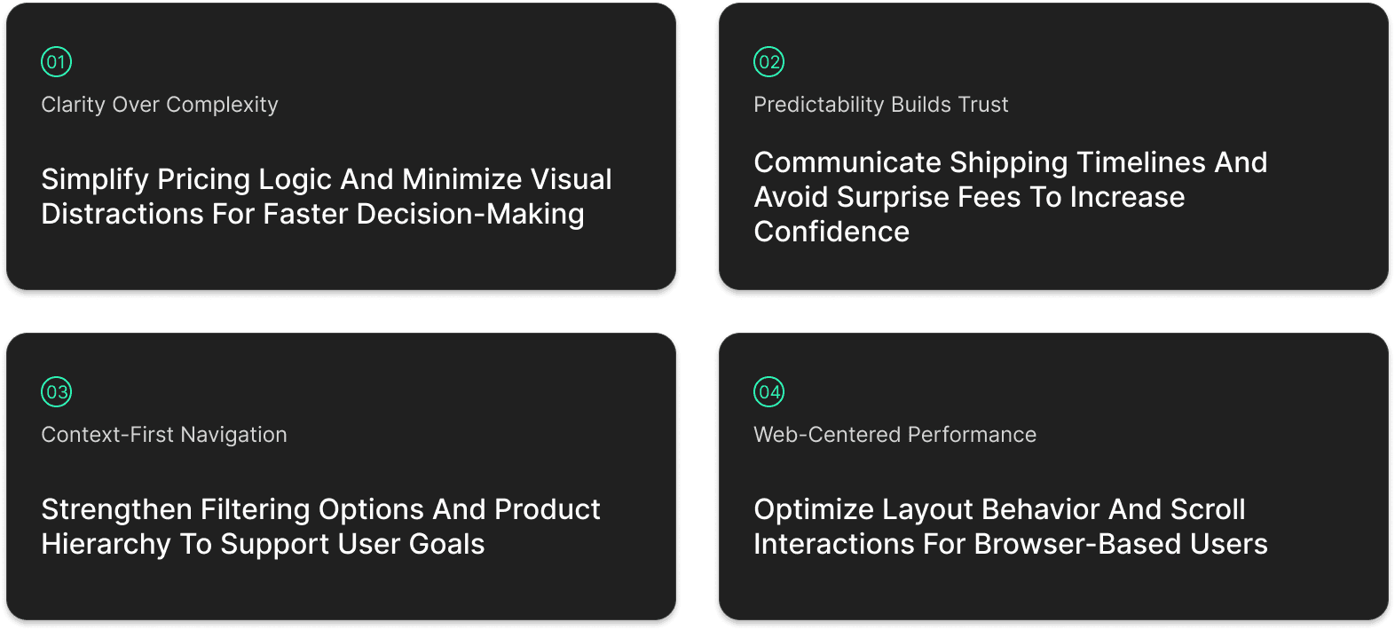
Translating Problems into UX Strategy
To address these issues, we established key UX goals that aligned with both user needs and business priorities. Guided by usability heuristics and UX laws, we focused on three strategic pillars: reducing friction, improving clarity, and rebuilding user trust. These goals served as the foundation for the redesign process and ensured our decisions were both user-centered and outcome-driven.
SOLUTION
Making everyday orders feel effortless
Based on user research and business goals, we proposed targeted design solutions that addressed the most critical usability challenges. From product discovery to pricing clarity, each change aimed to reduce friction, improve trust, and enhance the overall shopping experience.

IMPACT
Impact Post-Update
While the full implementation is still in progress, several of our key design recommendations have already been adopted by Kim’C Market. Early performance indicators show promising improvements:
IMPROVED CONVERSION RATE
2.27%
CART ABANDONMENT RATE
76%
BOUNCE RATE
62%
Next project: